Ever since I wrote my mid-project evaluation, my opinion of photography has not changed to a great extent, if anything, I find it more enjoyable. I find both the shoots and the editing of the photographs fun to do, and whilst there may be a lot of writing about photographers and their individual styles, I find the overall subject very much enjoyable and often look forward to the days in which I take the photographs. Also, I have found that my skills in photography have improved by a lot ever since I began, due to being taught the correct ways to hold the camera and what angles are best to take photographs at.
I found that my favourite part of the entire course of photography was the second walk shoot. This is due to the fact that I was able to find many examples of autumn colours, back of heads and journey photographs. I also really enjoyed the Mapplethorpe shoots, due to the fact that it was different to any of the formal elements or any of the other shoots that weren't formal elements that I had taken since the beginning of the course.
I found that my least favourite part of the entire course of photography was the multiple imagery shoot. I found this shoot extremely difficult due to the fact that at the beginning of the shoot, I was extremely confused as to what I was actually trying to capture. However, after being informed, I went out and shot multiple imagery, but found the editing side of it to be even more challenging. All these difficulties amounted to my eventual disliking of the topic.
Overall I have enjoyed the course of photography, despite there being some complications and difficulties during it, due to the fact that the majority of work set for us was enjoyable and not very stressful.
Sunday, 30 November 2014
Mapplethorpe Studio Work Diary
Evaluation:
The location shots allowed me to be warmed towards the styles Mapplethorpe has when I took photographs in the studio. Therefore I found that my studio shots were a lot more professional looking. In this photograph, it is evident that I spent more time than usual editing, for I have merged two half-face pictures together to form a whole face. I think this is the sort of thing Mapplethorpe would have done, so I am including it in my work diary.

Also, I used various backgrounds whilst taking photographs of half of her face, and even though the photos are in black and white, the difference in colour is evident through tone. As tone is one of the formal elements, I am happy with the way this photograph turned out compared to the other photographs.

Progression:
If I were to continue taking studio shots based on Robert Mapplethorpe's work, I would definitely try to get more photographs taken, and try and include more of the formal elements, such as form, colour and contrast, as well as keeping the original style of Mapplethorpe. An example of somebody's work that has included colour, yet they have still managed to capture the style Mapplethorpe possessed is Keir's photograph of Katy. This, in my opinion, shows the emotions Mapplethorpe was able to convey through his work, and is overall a very good photograph.

The location shots allowed me to be warmed towards the styles Mapplethorpe has when I took photographs in the studio. Therefore I found that my studio shots were a lot more professional looking. In this photograph, it is evident that I spent more time than usual editing, for I have merged two half-face pictures together to form a whole face. I think this is the sort of thing Mapplethorpe would have done, so I am including it in my work diary.

Also, I used various backgrounds whilst taking photographs of half of her face, and even though the photos are in black and white, the difference in colour is evident through tone. As tone is one of the formal elements, I am happy with the way this photograph turned out compared to the other photographs.
Progression:
If I were to continue taking studio shots based on Robert Mapplethorpe's work, I would definitely try to get more photographs taken, and try and include more of the formal elements, such as form, colour and contrast, as well as keeping the original style of Mapplethorpe. An example of somebody's work that has included colour, yet they have still managed to capture the style Mapplethorpe possessed is Keir's photograph of Katy. This, in my opinion, shows the emotions Mapplethorpe was able to convey through his work, and is overall a very good photograph.
Mapplethorpe Location Work Diary
Evaluation:
After doing research and watching videos about Robert Mapplethorpe's work, I admit that I was slightly apprehensive to try and recreate his work simply because of the uniqueness it held. However, I still tried to capture what Mapplethorpe had once captured to the best of my ability, and surprisingly, the results came out a lot more professional and generally better looking than I had pre-determined. This photograph shows a side angle of Keir, but not all of him. This feeling of incompleteness was inspired by Mapplethorpe's work, which is why I thought it was a good example from my shoot.


After doing research and watching videos about Robert Mapplethorpe's work, I admit that I was slightly apprehensive to try and recreate his work simply because of the uniqueness it held. However, I still tried to capture what Mapplethorpe had once captured to the best of my ability, and surprisingly, the results came out a lot more professional and generally better looking than I had pre-determined. This photograph shows a side angle of Keir, but not all of him. This feeling of incompleteness was inspired by Mapplethorpe's work, which is why I thought it was a good example from my shoot.

The second photograph that I think connected to the style Mapplethorpe possessed was of Katy. This photograph, yet again, added feelings of incompleteness, due to half her face being off frame. This is one of my favourite photographs of the shoot, simply because I believe it reflects what message Mapplethorpe was trying to give in his portraits containing only some parts of someone's body or face. Tone is an example of a formal element used here, and was commonly used within Robert Mapplethorpe's work as well.

Progression;
A lot of my photographs were of the full face of my peers, which didn't seem to be inspired from Mapplethorpe's work. If I went out to capture Mapplethorpe again, I would definitely take more photographs similar to the ones above. An example of this type of work would be from Ellie, who has managed to capture such a style, which is shown below. Other than that, I had no regrets, and very much enjoyed the session.

Annie Leibovitz

The formal element of tone is used to show the vibrancy or paleness of a colour without directly showing the actual colour, and in my opinion, she has achieved this objective. Leibovitz's photographs of celebrities became very popular during her time taking photographs for Vanity Fair magazine. It is clear that she tries to include more than one formal element in her portraits, for example, in this photograph she has used both reflection and form:
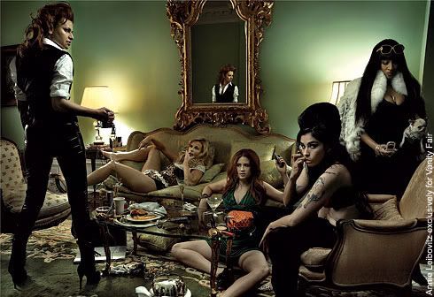
Reflection is used simply to show the mirroring of an object or a person, or a copy of it/them, whereas form is used to show the dimensions of an object or person. In the above photograph, Leibovitz has used celebrities to allow these formal elements to become evident. Colour is also used here, looking at the walls and the props scattered across the room that have been used to contrast each other. As contrast is another formal element, I found the way in which Leibovitz has portrayed it in this photograph very nice:
The contrast used in this photograph is the difference between young and old, which is shown with the wrinkles in skin, and the colour of the hair. I find Annie Leibovitz's work particularliy inspiring due to the fact that she has tried to put more than one formal element in each of her pictures. This has influenced me to try and look for more than one formal element, or even create some formal elements around a natural formal element. For example, the photograph below includes colour, reflection and lines.

Annie Leibovitz inspires me due to her differences in the photographs she takes. Each of her photographs take place in a different environment, yet still contain people. From this I have learned that the background of a photograph is very much important, just as important as the facial expressions and body positioning of the people that feature in it. Also, Leibovitz uses a wide variety of formal elements, which has inspired me to look for various formal elements, particularly in my location shoots, but also in my studio shoots. An example of when I have managed to use the background of a photograph is from my back of heads location shoot. There are similarities in both of these photographs in terms of how the background has been used as well as the person, instead of just focusing on the person. You can see the field and even other people in the background of this photograph, much like you can see details in the back of Leibotvitz's photographs.

To summarise, many people would assume that the photographs that Annie Leibovitz takes are simply portraits of famous people, however, I would disagree and say that her photographs explore the many formal elements used in photography, and her way of taking them allows us to see the emotions felt by the people having their photograph taken, which doesn't always work as well as it has with Leibovitz. I very much like her photographs for all of these reasons, and might base some of my portraiture work on some of the photographs she has taken before.
Thursday, 27 November 2014


Mapplethorpe Image Bank


It is immediately noticeable that the main thing that all these photographs have in common, aside from the fact that they've been taken in black and white, is that all the people within the portraits are looking at the camera. Various emotions have been portrayed throughout the six images that I have chosen, such as anger, and some of them even include photographs of just a blank expression. Props have also been used to the effect of these photographs, for example, the knife held by Mapplethorpe himself, or the hat, worn by Donald Sutherland in the last image. Also, each of these photographs include much of the background, which is part of Mapplethorpe's style.
Monday, 24 November 2014


Wednesday, 19 November 2014
Connecting Essay 2
Picture I Have Found:
I found this picture by searching 'Arrow On Road' into google images. Due to the boldness of the blue sky in contrast to the paleness of the grey road, it stood out to me the most out of all of the photographs of arrows on roads. An example of a formal element used here is depth. Depth is shown within the picture by having the photograph taken from a point of the road where it seems like it's getting smaller as it goes along, yet it is only getting further away. Another formal element used in this photograph is shape. Obviously, an arrow is considered a shape, so can be classed as use of one of the formal elements. Lines and texture are also examples of formal elements that can be found within the photograph.
Picture I Have Taken:

I took this picture during the shape session most recently in photography, and I was quite happy with how it came out. Even though I was trying to capture only the formal element of shape, other formal elements have been captured in the photograph, such as depth and texture. Depth is shown for the road and the arrow both appear to go inwards from wide to thin from the angle at which I have taken the photograph. Texture can be seen on the road, for the roughness of it is evident through the many holes in the ground.
Similarities:
Although I was quite proud of my own picture of the arrow on the road, I have to say that the better photograph of the two is the one I found by searching 'arrow on road' on google images. This is not only because of the far more detailed colour put into it, but also because there is a lot more scenery in the background of the picture, and mine mainly focuses on just the arrow and the road, not any of it's surroundings. However, my picture could be viewed as being the better photograph because of this fact, for many people hold the belief that less is more, and having an unexciting photograph with not much to go on is actually good.
Tuesday, 18 November 2014
Connecting Essay 1
Picture I Have Found:

I found this photograph by searching 'red berries' on google images. Like the search would suggest, this picture shows a bunch of vibrantly red berries. I think this photograph is good for showing the formal elements of colour, pattern and shape. It shows colour due to the vibrant redness of the berries, which are at the centre of the photograph, and it has a natural green background due to the leaves on the tree that the berries are growing on. The picture shows pattern through the repetitive shape of the red berries. It also shows shape through the spherical form of the red berries, and when all grouped together, creating some odd shape overall.
Picture I Have Taken:

I took this photograph within the first few weeks of beginning the photography course, and has always been one of my favourites due to the vibrancy of the red berries and the fact you can
see the leaves clearly in the background, showing that these berries are still part of a tree and still growing, having not been picked. This photograph shows the formal elements of colour, pattern, shape, texture and, at close observation, lines. Colour, pattern and shape are all found within the red berries, due to their redness, their repetitiveness and their spherical form, but texture is also evident within the photograph on the leaves. You can see, due to the clear quality of the photograph, that these leaves have quite a bumpy, rough texture, whereas the berries have a smooth, shiny, maybe wet texture. Aside from the ordinary lines within the leaves, there is only one line that stands out, and that is the bright yellow line that separates the brown part of the leaf on the right to the green part.
Similarities:
Both these pictures are very similar in their formal elements, and basically what the picture is actually of. The formal elements used in both of them are colour, pattern and shape, for they both contain the red berries grouped together on the branch of a tree. Not to appear big headed, but I actually prefer my photograph out of the two, due to the fact that you can see the leaves clearly in mine, the red berries have a nicer shade of red, and there are two more formal elements in my photograph than in the other one. These extra two formal elements are texture and lines. I described above their role in the photograph, which I find are quite important roles. Overall, both pictures are very similar to each other, but my photograph apparently shows more detail than the photograph I found on the internet, but that may be just due to my editing.
Thursday, 6 November 2014
Walk One: Work Diary
Evaluation:
This session was probably the most fun session that I have taken part in so far, due to the extent in which we could take photographs. The entire class walked around parts of Harlow in order to capture photographs of autumn colours and a journey. I enjoyed this session because it allowed my creativity to expand, because we had more than one objective. Below is an example of one of my better photographs, depicting the bold and bright colours of autumn leaves.


This session was probably the most fun session that I have taken part in so far, due to the extent in which we could take photographs. The entire class walked around parts of Harlow in order to capture photographs of autumn colours and a journey. I enjoyed this session because it allowed my creativity to expand, because we had more than one objective. Below is an example of one of my better photographs, depicting the bold and bright colours of autumn leaves.
After finding all the photographs of autumn colours that I wanted, I decided to move onto the 'Journey' part of the session. Benches in various places were able to show a journey, so I took one of George sitting on a bench and edited it using curves and lines on photoshop. This is the mentioned photograph below:
Progression:
Although I found the session very enjoyable and therefore was able to take a lot of photographs, I didn't take many of the other specific objectives (back of heads, journey) and instead focused on autumn colours. In the next walk, I will try to get more journey and back of head shots in order to complete the specific objectives to my best ability. An example of a photograph that was able to show the back of someone's head and the surrounding area that I will aspire to learn from is by Josh.


Subscribe to:
Posts (Atom)