Jay Maisel:
The first photographer I have chosen to write about in detail is Jay Maisel. In this detailed log, I will be writing about who Jay Maisel is, what style of photography he uses, why I have chosen him, what it is about his photography that I like, and how his work relates to any of the formal elements commonly used by photographers.
The first photo I saw of Maisel's work was of what appears to be the inside of a clock tower. I immediately liked this photo because of the contrast of colours used within it. The majority of the photo appears to be black and white, so I had assumed that the photo was taken with that effect in mind, or that it was taken before coloured photography was introduced, but as I continued to observe the photo, my attention was taken outside the window in the photo. There was, as I had previously missed, colour in the photo, showing the buildings and sky outside. I began looking at more of his work, and decided that due to this style of photography, I would be writing about him in my detailed log. Here is the first picture of his that I saw:

I mentioned briefly earlier about contrasts in colour, and how they are effective. These effects can be linked to two of the formal elements. The first is, obviously, colour. The fact that I had to look more than once to see that the photo was not in fact a black and white photo means that the use of colour was discreet. This is effective, because usually our attention is brought immediately to any signs of colour, yet when I first looked at the picture, the black and whiteness of the clock was the first thing I paid any attention to, meaning this photograph is quite controversial and unlike many other photographs by famous photographers.
There is a second formal element involved that is not connected to the colour or shade used within the photograph. This formal element is 'shape'. The clock portrays three circles, two of which were constructed as the outer layer of the clock face, and the other as the inner layer. In between each of the layers, there are roman numerals to, obviously, indicate the time, (although roman numerals are more 'shape-like' than numbers). There are other formal elements evident in other photographs Maisel has taken, such as the element of reflection, which is evident in this one:

The third formal element used is slightly similar to colour, yet is used in an entirely different way. This is the element of tone. Seeing as tone is basically the range of light to dark in part of an image, the definition of it suits the photograph perfectly, for that is what it is portraying. However, it could be argued that because the white is a more vibrant shade than any of the colours shown outside, the photograph is not controversial, because the whiteness is the closest thing we connect to colour due to it's vibrancy.

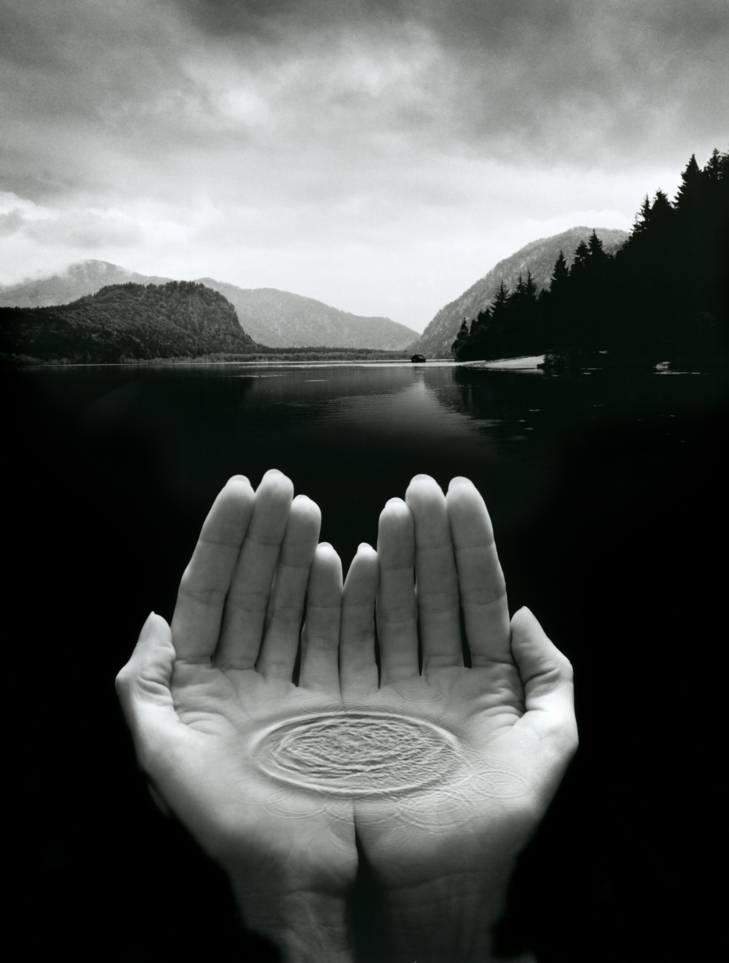
Although he hasn't had a huge effect on the ways in which I take photographs, Jay Maisel has definitely opened my eyes to new forms of taking photos that I don't think I could have figured out prior to discovering him. For example, the styles used in his photograph of the clock and the wine glasses are quite basic, until you look at them in more detail. At first glance, the clock is literally just a clock, but with more observation, you can see the detail outside the window. Also, the wine glasses reflect the buildings of what appears to be a city, which also requires the ability to pay attention to small detail. Jay Maisel's work tends to be very symbolic, and an example of one of my photographs that mirrors such symbolism is from my shape shoot. This is the photograph:

To summarise, Jay Maisel has had somewhat of an influence on how I view certain photographs in photography, but has not necessarily had much of an effect on how I physically take any of my photographs. Despite the fact that I do like the style used in much of Maisel's work, I don't intend to try and replicate it in any way, for it is not the style that I would like to pursue throughout my photography course.
To conclude, formal elements have been used within Jay Maisel's work to a great extent to improve the effectiveness of his photography. I personally like these effects, and I think they have worked very much in his favour due to the popularity of his photography, and how much money he has earned from it. Here is another picture that I am partial towards by Maisel: